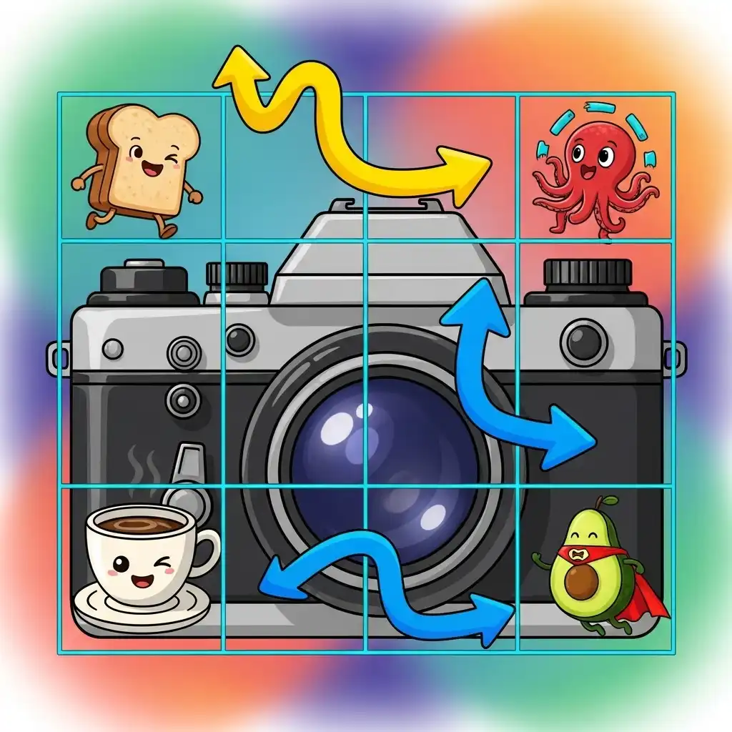
Ask yourself why some photographs feel calm and engaging while technically identical ones feel static. Very often the difference is placement, not subject. The rule of thirds is photography's oldest and most reliable composition framework: a simple three-by-three grid that shows where the human eye naturally wants elements to sit.
In this guide you get the rule of thirds in photography explained for beginners — what the grid really means, where to place subjects and horizons, the mistakes that ruin good compositions, and how to rescue older photos by recomposing them in our free online image cropper with rule of thirds grid, directly in your browser.
What Is the Rule of Thirds (and Why It Works)
Imagine dividing your frame into nine equal rectangles with two evenly spaced horizontal lines and two vertical lines. This creates four intersection points and eight guiding lines. The rule of thirds states that placing your most important elements along those lines or at their intersections — instead of dead center — produces compositions that feel balanced yet dynamic.
Why does it work? Human perception finds perfectly centered compositions static and predictable, while off-center arrangements generate subtle tension that holds attention longer and invites the eye to travel through the frame. The grid also forces a decision about negative space, and what you leave empty is often what gives the subject room to breathe. Crucially, it is a framework, not a law: it trains your eye until good placement becomes instinct.
How to Use the Rule of Thirds Grid: Placement Basics
Start with the four intersection points: they are the natural anchors for a subject's eye in a portrait, a lone tree in a landscape, or a product in a catalog shot. Next, the lines: horizons belong on the top or bottom line, and vertical elements — masts, towers, standing figures — gain quiet strength when aligned with a vertical line.
Then, direction: subjects that look or move need space in front of them; place a runner on the left intersection facing right, and the empty two-thirds become narrative instead of emptiness. Finally, balance: a strong element on one side can be answered by a smaller element on the opposite intersection, creating visual dialogue rather than monologue.
Rule of Thirds in Photo Editing: Recomposing with the Crop Tool
The rule does not end at the shutter — cropping is composition's second chance. Nearly any centered snapshot can be recomposed in post: open the image in our Image Cropper, enable the built-in compositional grid overlay, and drag the frame until your subject lands on an intersection or your horizon snaps to a third.
While recomposing, watch three things. Resolution: cropping discards pixels, so verify final dimensions before exporting. Aspect ratio: use presets like 1:1 for Instagram, 16:9 for YouTube, or 4:5 for portraits, and re-evaluate placement for each ratio, because a composition that works square can fail wide. And edges: every crop moves new elements to your borders, so inspect them before confirming.
Where to Place Your Subject: 4 Quick Scenarios
Portraits: put the closest eye on a top intersection, let the face occupy one column, and let the gaze flow into the empty two-thirds.
Landscapes: horizon on the lower third to give the sky the drama, or on the upper third to give the land the weight — never in the middle unless you are shooting a reflection.
Street and product: subject off-center, balanced by texture, signage, or shadow on the opposite side.
Wildlife and sports: place the subject on the intersection behind its direction of movement, leaving the space ahead for the motion to unfold.
Common Rule of Thirds Mistakes (and How to Fix Them)
Treating intersections as bullseyes: they are zones, not coordinates — a subject a few pixels off the point still reads perfectly. Forcing the grid on symmetrical scenes: a centered reflection or façade wants center placement, and the grid only weakens it.
Ignoring the edges while chasing the grid: a perfect intersection means nothing if a bright twig sits at the border pulling the eye outward. Cropping without checking resolution: recomposition is free only when the final size still serves its purpose. And applying the rule without intention: the grid should support the story, never replace it.
When to Break the Rule of Thirds on Purpose
Some images are stronger centered: symmetry in architecture, reflections, and formal portraits; minimalism where a small centered subject floats in vast negative space; and confrontational portraits where direct central placement creates intimacy or tension. Breaking the rule works when the break itself is the message — stability, formality, stillness.
The professional habit is simple: compose with the grid by default, and break it only when centering says something the grid cannot. Once you can place elements fluently on the thirds, you earn the right to ignore them deliberately.
Frequently Asked Questions
What is the rule of thirds in simple terms?
Should the horizon be on the upper or lower third?
Can I apply the rule of thirds after taking the photo?
Does the rule of thirds work for portraits and product photos too?
Is there a free image cropper with rule of thirds grid online?
The Takeaway
The rule of thirds is the cheapest composition upgrade in photography: one grid, four points, endless calm. Compose with it by default, recompose with it in the crop, and break it only when centering tells the truer story. Practice now in our Image Cropper — your files never leave your browser.
Key Takeaways:
- Intersections are anchors and lines are for horizons and verticals.
- Give moving or looking subjects space ahead of them.
- Recompose old photos with a grid-enabled cropper.
- Check resolution and edges after every crop.
- Break the rule only on purpose.