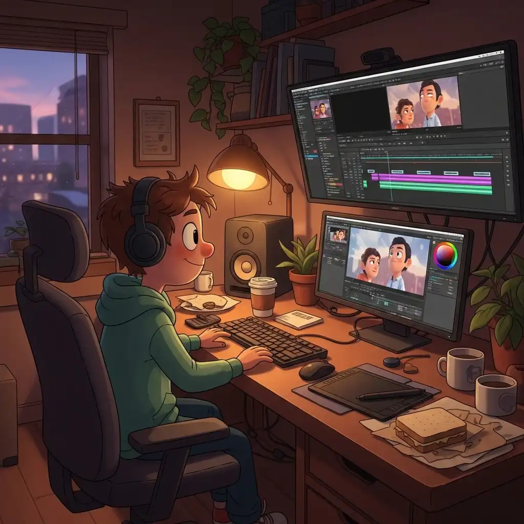
You calibrated your monitor, you read the histogram, you checked your skin tones with the color picker — and yet the print came back too dark, or the Instagram post looked greenish on your phone. The culprit is rarely the screen or the edit; it is the room. Your editing environment is the invisible half of your color system: it dictates how your pupils dilate, how your brain white-balances the world, and how you perceive contrast. In this guide you will learn why your photos look different at night, how room light physically alters your color perception, the ideal ambient setup for photo editing, the professional secret of bias lighting, and how to anchor your decisions with objective tools like our Color Picker when your eyes inevitably adapt.
Why Your Photos Look Different at Night (The Pupil Problem)
The most common editing mystery has a biological answer. In a dark room, your pupils dilate to gather more light, and your monitor suddenly appears blazingly bright — so you compensate by darkening the image, producing prints and exports that look muddy in daylight. In a brightly lit room, your pupils constrict, the display looks dim, and you push exposure and shadows upward, creating washed-out results. Your eyes are not lying; they are adapting to the ambient light, and your edits compensate for that adaptation rather than for the image itself. This is why the same editor, on the same calibrated monitor, produces different results at 10 AM and 10 PM. The room is part of the instrument, and an uncontrolled room guarantees inconsistent work.
How Room Light Affects Color Perception (Chromatic Adaptation)
Your brain constantly white-balances the world, a phenomenon called chromatic adaptation. Sit in a room lit by warm 2700K tungsten bulbs, and your brain discounts the orange cast so that white paper still looks white to you — but your monitor's neutral 6500K white now looks cold and blue by comparison, so you warm up your edits to compensate. Sit in a room with cool daylight or fluorescent light, and the opposite happens: your edits drift cool. Colored walls, bright posters, and saturated furniture also reflect onto the screen and into your peripheral vision, tinting your perception of neutral grays. The result is systematic color error that no monitor calibration can fix, because calibration corrects the display, not the room bouncing colored light into your eyes.
The Ideal Editing Environment (What Professionals Build)
The professional standard is surprisingly specific. Ambient light should be dim, indirect, and neutral — roughly 10% to 25% of your monitor's brightness, so the screen dominates without floating in darkness. The color temperature of the room light should match the monitor's white point: 6500K (D65) for web-first work, 5000K (D50) for print-critical environments. Walls behind the monitor should be neutral gray or muted, not saturated colors that reflect onto the screen. Direct light sources — windows, desk lamps, overhead spots — should never hit the screen or your eyes; glare destroys contrast perception instantly. The goal is an environment that neither adds color nor competes for attention, leaving the monitor as the sole visual reference.
Bias Lighting: The Colorist's Secret Weapon
Bias lighting is a soft, neutral light source placed behind the monitor, illuminating the wall directly behind it. It sounds counterintuitive — adding light to improve contrast — but it works through a physiological mechanism: it stabilizes your pupil size, reducing eye strain during long sessions, and it raises the perceived black level of the display so shadows read as richer and deeper. Professional color grading suites use bias lighting universally, typically at 6500K to match the monitor's white point. A simple LED strip with a high CRI (Color Rendering Index) mounted behind the monitor transforms a harsh screen-in-darkness setup into a stable, comfortable viewing environment. It is the single cheapest upgrade an editor can make to their color perception.
How to Set Up Your Editing Environment Step by Step
- Paint or cover the wall behind your monitor in neutral gray or off-white; remove saturated posters and bright decorations from your peripheral vision.
- Block direct light: close blinds on windows, reposition desk lamps so they illuminate the desk without hitting the screen or your eyes.
- Install bias lighting behind the monitor — a 6500K LED strip with high CRI, dimmed to roughly 10–20% of the monitor's brightness.
- Set your ambient room light to match: neutral white bulbs (5000K–6500K) in indirect fixtures, dimmed low.
- Verify no reflections or glare on the screen from any angle you sit.
- Calibrate your monitor in this final environment, because the profile must compensate for the room you actually edit in.
- Use objective tools like our Color Picker to verify neutral grays and skin tones when your eyes feel adapted — numbers do not adapt the way pupils do.
Common Ambient Lighting Mistakes (and How to Fix Them)
- Editing in complete darkness, which forces pupils wide open and makes every exposure judgment too dark — add bias lighting and dim ambient light.
- Editing under warm household bulbs without compensating, which pushes every edit toward orange to fight the room's cast — switch to neutral 5000K–6500K bulbs.
- Sitting with a bright window behind the monitor, which crushes perceived contrast and drives you to over-brighten — close the blinds or reposition the desk.
- Colored walls behind the screen reflecting onto the display — paint them neutral.
- And trusting your eyes alone after thirty minutes in the room: adaptation is inevitable, so verify critical color decisions with numerical readings from a color picker rather than with adapted perception.
Frequently Asked Questions
What is the best lighting for a photo editing room?
Why do my photos look different at night?
How does room light affect color perception?
What is bias lighting and why do I need it?
Can I verify colors objectively when my room light is imperfect?
The Takeaway
Your editing room is half of your color system: uncontrolled ambient light guarantees inconsistent results no matter how good your monitor is. Build a dim, neutral environment with bias lighting behind the screen, match your bulbs to your monitor's white point, eliminate glare and colored reflections, and verify critical colors with numerical tools when your eyes adapt. Build your environment around our Color Picker's truth — your files never leave your browser.
Key Takeaways:
- Pupils dilate in darkness and constrict in brightness, shifting every exposure decision.
- Chromatic adaptation makes warm rooms produce cool edits and vice versa.
- Bias lighting is the cheapest perception upgrade available.
- Neutral walls beat saturated ones.
- Numbers from a color picker are the final anchor when your eyes stop being trustworthy.