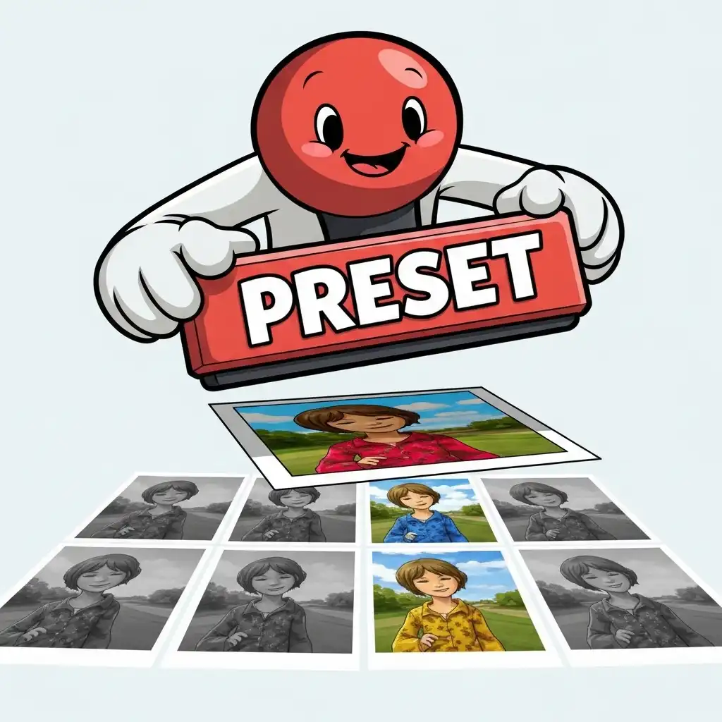
The internet is full of promises selling the "one-click perfect edit" — a magic preset that will instantly transform any photograph into a masterpiece. The reality of professional editing is both less magical and far more powerful: presets are not creative shortcuts that do the work for you, they are efficiency tools that handle technical repetition.
When you master how to create custom presets in photo editing, you stop wasting mental energy on baseline adjustments and free your attention for the image-specific decisions that actually matter. In this guide you will learn what a preset actually is, how to build a consistent editing style before trying to save it, a step-by-step workflow for creating and organizing your library, why presets must always be starting points rather than finish lines, and the mistakes that make portfolios look formulaic — all practicable in our Photo Editor.
What a Preset Actually Is (and What It Isn't)
A preset is simply a saved recipe of technical decisions: a specific tone curve, a color balance shift, a grain intensity, a split toning configuration. When applied, it replays those decisions on a new image. What a preset is not is a substitute for judgment. It cannot know that today's portrait was shot in cool window light while yesterday's was shot in warm sunset; it cannot know that this landscape needs a lifted shadow while that one needs crushed blacks.
Thinking of presets as automated finish lines leads to the muddy, inconsistent results that plague amateur portfolios. Thinking of them as automated baselines — a way to reach your personal "zero point" in two seconds instead of two minutes — transforms them into the most powerful workflow accelerator a professional can own.
Presets vs Filters vs LUTs: Knowing the Difference
The terms are often used interchangeably, but they describe different levels of control. A filter, in the social media sense, is usually a baked-in, destructive look applied at full strength with no granular control. A LUT (Look-Up Table) is a mathematical color translation, excellent for cinematic grading but blind to exposure, contrast, and local adjustments.
A true photo editing preset is the most comprehensive: it can store exposure offsets, curve shapes, HSL shifts, grain settings, and even local mask configurations depending on the software. Because presets live inside the editing environment as adjustable layers or parameters, they remain fully non-destructive. You can apply a preset and immediately dial its opacity back, tweak its curves, or mask it away from the subject — flexibility that filters and LUTs rarely offer.
How to Build a Consistent Editing Style (Before Saving a Preset)
You cannot save a style you have not yet found. Before creating presets, spend a few weeks editing diverse images — portraits, landscapes, street, product — without saving anything. Look for the recurring moves you make naturally: do you always lift the blacks slightly for a matte film look? Do you consistently pull green luminance down for moodier foliage? Do you favor warm highlights and cool shadows?
These unconscious habits are the seeds of your visual signature. Once you notice yourself making the same three or four adjustments on every single image regardless of subject, you have found your baseline. That baseline, and only that baseline, is what deserves to become a custom preset.
How to Create and Save Custom Presets Step by Step
- Edit a "hero" image that represents the middle ground of your work — average lighting, standard subject — until it perfectly reflects your desired signature look.
- Audit the stack: identify which adjustments are universal (like a subtle film grain, a baseline contrast curve, or a specific color grading split) and which are image-specific (like a localized dodge on the subject's face or an exposure fix for a dark room).
- Select only the universal adjustments to include in the preset.
- Save the configuration in our Photo Editor, giving it a clear, descriptive name like "Baseline - Matte Film" or "Signature - Warm Portrait".
- Test the new preset on five completely different images — a bright landscape, a dark interior, a cool-toned street shot — to see where it breaks and where it sings.
- Refine the saved recipe based on the test, removing any parameter that caused catastrophic failures on diverse lighting.
Why Presets Must Be Starting Points, Not Finish Lines
The golden rule of professional preset use is that the preset gets you to eighty percent, and your eye handles the final twenty. Lighting conditions, subject matter, and exposure always demand nuanced adaptation. A preset designed for golden hour will turn a cloudy winter portrait sickly orange if applied blindly.
After clicking the preset, immediately check white balance and exposure — the two variables no preset can predict. Then evaluate the local adjustments: does the contrast crush the shadows too much for this specific scene? Does the color grade fight the subject's clothing? Treat the preset as the foundation of a house; you still have to paint the walls and arrange the furniture for the specific people who will live there. This practice builds recognizable style without sacrificing individual attention to the photograph.
Organizing a Preset Library (Infrastructure for Speed)
As your library grows, chaos destroys the efficiency you built it to create. Organize presets by function, not by chronology. Create folders for "Baselines" (your everyday starting points), "Creative Grades" (strong cinematic or stylized looks), "Utility" (black and white conversions, film grain emulations, sharpening routines), and "Corrections" (quick fixes for specific lens profiles or common color casts).
Name them systematically: "Base - Soft Matte," "Grade - Teal Orange Subtle," "Util - Fine Grain 2%." Delete presets you no longer use; a library of fifty trusted tools is infinitely faster to navigate than a library of five hundred abandoned experiments. Your preset library should become an extension of your visual language, streamlined and ready for instant deployment.
Common Preset Mistakes (and How to Fix Them)
- Applying a preset and exporting immediately without checking exposure or white balance — the fastest way to ruin a good photograph.
- Buying or downloading massive preset packs and using them blindly, resulting in a portfolio that looks like everyone else's instead of your own.
- Including image-specific local masks in a global preset, causing bizarre artifacts when applied to differently composed images.
- Refusing to tweak the preset's opacity, forcing a heavy look onto a delicate subject.
- Confusing consistency with uniformity: a consistent style means the images feel like they belong to the same family, not that they are identical clones ignoring their unique lighting and context.
Frequently Asked Questions
How do I create custom presets in photo editing?
Why do my presets look bad on other photos?
What is the difference between a preset and a filter?
How do I build a consistent editing style for Instagram or my portfolio?
Can I save and use custom presets in a free online photo editor?
The Takeaway
Custom presets are efficiency tools that handle technical repetition, freeing your mental space for the creative decisions that make a photograph sing. Build your style first, save only the universal baseline adjustments, organize your library by function, and always treat the preset as a starting point that requires exposure, white balance, and local adaptation.
Key Takeaways:
- Presets are recipes, not magic wands; they get you to eighty percent, your eye finishes the job.
- A consistent style respects the unique lighting of every scene.
- Save only universal baseline adjustments, leaving image-specific edits out of the preset.
- A curated, organized library is a professional's greatest workflow asset.
Build your signature in our Photo Editor — your files never leave your browser.