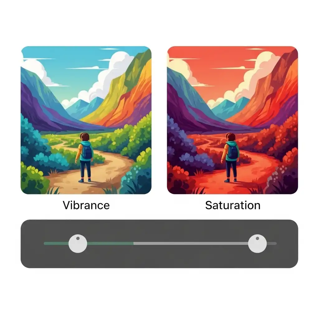
Every editor eventually meets the same disappointment: a vibrant landscape on screen that prints as a neon poster, a warm portrait whose skin turned orange after a confident saturation boost. The culprit is rarely a broken tool — it is the confusion between two sliders that look identical but behave in opposite ways: vibrance and saturation.
Both increase color intensity, but they do so with profoundly different logic, and choosing the wrong one is the single fastest route to oversaturated, amateur-looking images. In this guide you will learn what each tool actually does, why vibrance is the safe default for most edits, when saturation deserves its place, how to protect skin tones during color boosts, and the mistakes that turn natural scenes into cartoon palettes — all practicable in our Photo Editor.
What Saturation Actually Does (The Blunt Instrument)
Saturation applies a uniform multiplier to every color channel in the image, without exception. A muted gray sky, a deep blue ocean, a skin tone already rich in red, and a neon sign all receive the same percentage increase in intensity. That is why saturation feels powerful at first — everything pops — and why it fails so predictably on complex scenes: the colors that were already intense get pushed into clipping, while the muted ones finally come alive, producing an unbalanced palette where reds and oranges scream while neutrals barely register.
On portraits, saturation is especially dangerous: skin contains reds and yellows that amplify fast, turning complexions orange, ruddy, or sunburned with a single enthusiastic slider push. Saturation is a blunt instrument, effective only when every color in the frame genuinely needs the same lift.
What Vibrance Actually Does (The Intelligent Tool)
Vibrance is saturation with a brain. Instead of multiplying every color equally, it applies a non-linear boost: muted colors receive strong intensity increases, while already-saturated colors receive little to none. More importantly, vibrance includes a skin-tone protection algorithm that detects reds and yellows in the range typical of human complexions and deliberately limits their amplification.
The result is a lift that feels balanced: the pale sky gains richness, the faded foliage deepens, the pastel dress comes alive, and the subject's skin remains believably human. That is why vibrance is the professional default for general color enrichment — it adds life without the overshoot, working as a smart compressor for color intensity rather than a blind amplifier.
Vibrance vs Saturation: A Side-by-Side Comparison
The difference becomes visible in three classic scenarios. A portrait with warm natural skin: saturation turns the face orange within a few clicks, while vibrance enriches the background clothing and environment while the complexion stays natural. A landscape with an already-vivid sky and muted foreground: saturation clips the sky into a solid blue block while the foreground barely changes, whereas vibrance leaves the intense sky alone and boosts the muted foliage, producing a balanced final image.
A product shot on a neutral background: saturation pushes every color uniformly, often oversaturating the product's logo or accent colors, while vibrance lifts the duller elements and leaves the already-vivid branding intact. The rule is simple: when the scene contains colors of mixed intensity, vibrance handles the balance; when every color is genuinely under-saturated and deserves the same lift, saturation is the right tool.
How to Avoid Oversaturated Skin Tones (The Portrait Rule)
Skin tones are the canary in the color-grading coal mine: they reveal oversaturation before any other element. Three habits protect them. First, use vibrance as your default color boost for any image containing people; its built-in protection keeps complexions in the human range. Second, if you do reach for saturation, apply it selectively — on a masked adjustment layer that excludes skin — rather than globally.
Third, monitor the red and yellow channels through a histogram or vectorscope: when skin values climb past predictable ranges, you have crossed the line from warm to orange. And always judge skin at viewing distance, not at 100% zoom, where color shifts accumulate invisibly. A good test: if the subject would not recognize themselves, the color has gone too far, regardless of how striking the background looks.
When to Use Saturation (The Surgical Cases)
Saturation is not obsolete — it is specialized. It shines in four specific situations. First, when a single color channel needs a targeted boost and you can mask the rest: saturating only the reds of a flower while protecting everything else. Second, when working with deliberately stylized or graphic images — illustrations, product mockups, pop-art styles — where uniform intensity is the goal.
Third, on scenes that are genuinely under-saturated across the board, such as foggy overcast days or desaturated film scans, where every color deserves the same lift. Fourth, inside HSL panel adjustments where you target one hue range at a time — effectively using saturation as a surgical scalpel instead of a brush. Outside those cases, vibrance is almost always the better first move.
How to Use Vibrance and Saturation Together (A Professional Workflow)
The professional habit is not to choose one or the other, but to deploy them in sequence with distinct roles.
- Start with vibrance for the foundational color lift — typically a modest value between ten and twenty percent — trusting it to balance muted and saturated areas while protecting skin.
- Assess what is still missing: usually one specific color family, such as a dull sky or faded foliage.
- Address that specific family with targeted saturation through the HSL panel, which lets you boost only blues or only greens without touching the rest of the palette.
- Reserve global saturation for the rare image where every color genuinely needs the same lift, and keep its value low.
- Finish with the before-and-after toggle, comparing your color-boosted version against the original — if the edit looks like a filter rather than a lift, dial it back.
Practice the whole sequence in our Photo Editor, where vibrance, saturation, and HSL live together in one color panel.
Common Vibrance and Saturation Mistakes (and How to Fix Them)
- Maxing saturation globally and accepting neon results as "punchy" — vibrance at modest values achieves punch without the overdose.
- Using saturation on portraits without skin protection, producing orange complexions that no viewer accepts as human.
- Ignoring vibrance entirely and missing the easiest color-balancing tool in the panel.
- Boosting both sliders simultaneously, which compounds their effects into instant oversaturation.
- Applying color boosts before white balance is corrected — amplifying a color cast makes it harder to see and fix later.
- Judging saturation only on your own display without a device check: a color level that feels right on a vibrant monitor often looks garish on a phone or in print.
Frequently Asked Questions
What is the difference between vibrance and saturation?
When should I use vibrance instead of saturation?
How do I avoid oversaturated skin tones?
Can I use both vibrance and saturation on the same photo?
Are vibrance and saturation available in a free online photo editor?
The Takeaway
Vibrance and saturation are not interchangeable — they answer different questions. Vibrance asks which colors need help and boosts them intelligently; saturation asks how much intensity every color should gain and applies it blindly. Use vibrance as your default color lift, deploy saturation surgically through masks or the HSL panel, protect skin tones above all other elements, and let targeted adjustments beat global ones. Practice the distinction in our Photo Editor — your files never leave your browser.
Key Takeaways:
- Vibrance protects skin and already-intense colors.
- Saturation is the blunt instrument for specific jobs.
- A modest vibrance plus a targeted HSL saturation is the professional combo.
- Skin tones are the first casualty of careless saturation.
- The best color boost is the one the viewer feels as richness rather than sees as neon.