Pro Image Tips

Essential techniques to master digital photography editing (Part 3).

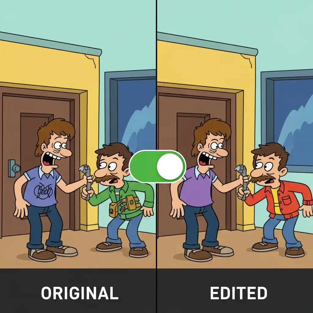
Side-by-side comparison of a photo before and after digital editing

Check Before/After

Apply the "before/after" toggle frequently during editing. Most software offers a shortcut (often backslash key) to instantly compare your current state with the original. This prevents gradual over-editing—small incremental changes accumulate into dramatic shifts that may look excessive when viewed against the starting image's natural appearance. Regularly checking your progress against the untouched version keeps adjustments grounded. Without this habit, you might push sliders too far, losing the photograph's authentic character. The toggle acts as an anchor, reminding you where you began. It's especially valuable during long sessions when your eyes adapt to increasingly stylized results. Make it reflexive—tap that key after every few adjustments. This simple discipline preserves intentionality and stops technical precision from overriding emotional truth in your final image.

Demonstration of a radial filter applying localized adjustments to a subject

Radial Filters

Use radial filters to draw attention through localized adjustments. Darken or desaturate peripheral areas slightly while keeping your subject bright and vibrant. This subtle vignetting effect guides the viewer's eye naturally toward your intended focal point without the obvious circular frame of traditional vignette tools. Position the filter's center precisely where you want focus, then feather edges generously for seamless transitions. Unlike global adjustments, radial filters respect compositional complexity—softening distractions without flattening dimensionality. They work beautifully on environmental portraits or landscapes where context matters but shouldn't compete visually. The key is restraint: adjustments should feel inevitable rather than applied. When done well, viewers sense the emphasis without noticing the technique itself, creating quiet visual hierarchy that honors both subject and surroundings.

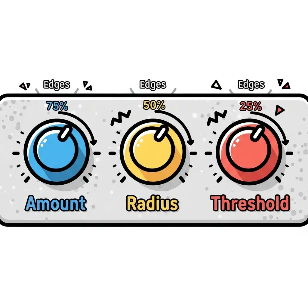
Close-up detail showing the effect of sharpening settings on image edges

Sharpening Components

Understand that sharpening has three components: amount, radius, and threshold. Amount controls intensity; radius determines edge width affected; threshold prevents sharpening of smooth areas (reducing noise). For screen viewing, typical values: Amount 60-80%, Radius 0.8-1.2px, Threshold 2-5. Adjust based on image resolution and subject matter. High-resolution files tolerate finer radius settings; portraits demand lower amounts to avoid emphasizing skin texture unnaturally. Threshold becomes crucial with high-ISO images—raising it protects smooth surfaces while preserving edge definition elsewhere. Always sharpen as your final step after resizing for output. Preview at 100% magnification to judge real-world impact. Remember that sharpening enhances perceived detail but cannot recover truly lost information; it's polish, not resurrection.

Correcting purple and green chromatic aberration along high-contrast edges

Chromatic Aberration

Remove chromatic aberration early in your workflow. These colored fringes along high-contrast edges (purple/green halos) distract viewers and suggest technical flaws. Most editors offer automatic lens profile corrections—enable this first before creative adjustments so you're enhancing image quality rather than compensating for optical limitations. Chromatic aberration stems from lens physics, not artistic choice, so eliminating it establishes a clean foundation. Manual correction tools let you target specific color channels if profiles miss subtle fringing. Addressing this upfront prevents compounding errors—later contrast or saturation boosts can exaggerate residual fringes. It takes seconds but signals professionalism. Viewers may not consciously notice its absence, yet its presence subtly undermines credibility. Treat it like dust spot removal: technical hygiene preceding creative expression.

Landscape photo demonstrating atmospheric perspective with fading distant mountains

Atmospheric Perspective

Create depth through atmospheric perspective in landscape edits. Distant elements naturally appear lighter, less saturated, and lower in contrast due to atmospheric particles. Enhance this effect subtly by reducing contrast and saturation progressively with distance—this mimics natural vision and adds dimensional realism that flat edits lack. Avoid uniform adjustments across the frame; instead, use graduated filters or layer masks to apply diminishing intensity toward the horizon. Mountains should feel miles away, not pasted onto the foreground. This technique works powerfully in foggy or hazy conditions but applies universally—our eyes expect this falloff. Overdoing it creates artificial separation; restraint yields believable space. When executed thoughtfully, viewers experience immersion rather than noticing the manipulation itself.

Example of split toning applying warm highlights and cool shadows to a photo

Split Toning

Use split toning intentionally for mood enhancement. Apply warm tones (yellow/orange) to highlights and cool tones (blue/teal) to shadows for cinematic depth. Keep saturation subtle—5-15% typically suffices. This technique works especially well for portraits and landscapes, adding emotional resonance without obvious color manipulation. Golden hour images benefit from reinforcing existing warmth; overcast scenes gain dimension through cool shadows. Avoid matching highlight and shadow hues—they should complement, not compete. Preview on calibrated displays since split toning shifts dramatically across devices. The goal isn't stylistic signature but emotional alignment: warmth suggesting memory, coolness implying contemplation. When saturation stays restrained, the effect feels inherent to the moment rather than layered atop it. This quiet color psychology elevates narrative without announcing its presence.

Comparison of different color temperature settings affecting image mood

Color Temperature

Mind the psychological impact of color temperature. Warm tones (2700K-4000K) evoke comfort, nostalgia, and intimacy—ideal for portraits and food photography. Cool tones (6500K-10000K) suggest clinical precision, melancholy, or futuristic aesthetics. Choose temperature deliberately to support your image's narrative rather than defaulting to "accurate" white balance. A slightly warm portrait feels inviting; the same warmth on surgical instruments feels unsettling. Context dictates appropriateness. Remember that cultural associations vary—warmth isn't universally positive. Trust your gut: does the temperature amplify what the image communicates? Technical accuracy serves storytelling, not vice versa. Sometimes "wrong" white balance tells truer emotional stories. Let intention guide sliders, not presets.

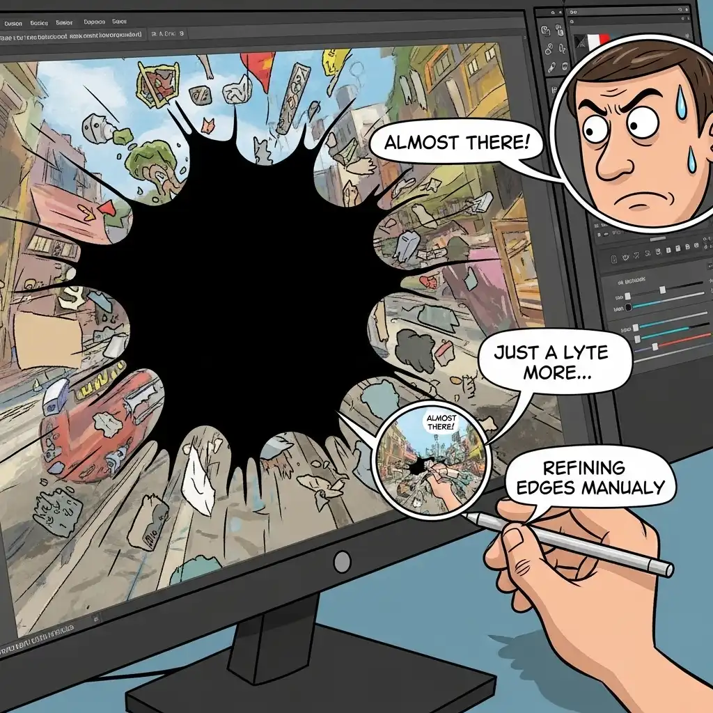
Using content-aware fill to remove unwanted objects from a scene

Content-Aware Fill

Use content-aware fill judiciously for object removal. While powerful, it often creates repetitive patterns or unnatural textures in complex areas. For best results: make precise selections, use multiple small fills rather than one large one, and always refine edges manually with cloning/healing tools to blend transitions seamlessly into surrounding detail. Content-aware works best on uniform backgrounds—skies, walls, water—but struggles with intricate textures like foliage or fabric. When it fails, the result feels uncanny rather than invisible. Patience pays: spending extra minutes with the clone stamp yields more authentic repairs. Treat content-aware as a starting point, not a finish line. The most convincing edits leave no trace of intervention—viewers should wonder what was removed only after you tell them.

Visual representation of the exposure triangle balancing aperture, shutter speed, and ISO

Exposure Triangle

Apply the "exposure triangle" concept to editing: balance highlights, shadows, and midtones like aperture, shutter speed, and ISO. Recovering shadow detail often requires accepting some highlight clipping—or vice versa. Perfect recovery across all tonal ranges is rarely possible; make intentional choices about where to preserve detail based on your subject's importance. A bride's dress might justify clipped highlights if her face retains texture; a landscape's sky can blow out slightly to save foreground richness. This trade-off mirrors photographic capture decisions. Don't chase technical perfection at the expense of emotional impact. Your subject dictates priorities: protect what matters most, let secondary areas fall where they may. Mastery lies in knowing which compromises serve the image's soul.

Adjusting specific hue ranges using selective color tools

Selective Color

Use selective color adjustments for nuanced control. Instead of global saturation changes, target specific color ranges—reduce red saturation slightly in backgrounds to make red subjects pop, or increase blue luminance in water while keeping sky blues unchanged. This surgical approach maintains natural color relationships while enhancing visual hierarchy. Selective hue sliders let you shift problematic tones without affecting harmonious ones—turning sickly greens toward teal while preserving grassy vibrancy. Luminance adjustments alter perceived weight: brighter colors advance, darker ones recede. These micro-adjustments create sophisticated balance impossible with broad strokes. Always preview changes at actual viewing size—subtlety that disappears when zoomed may dominate at screen resolution. Precision here separates competent edits from compelling ones.

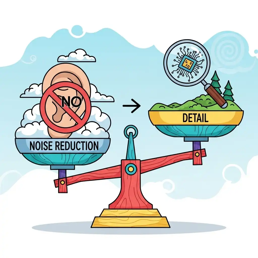
High-ISO photograph prioritizing emotion over technical perfection

Intentional Compromise

Understand that every edit involves compromise. Noise reduction sacrifices detail; sharpening amplifies artifacts; contrast enhancement may clip shadows or highlights. Professional editing isn't about eliminating all compromises—it's about making intentional trade-offs that serve your image's purpose while minimizing visible technical flaws that distract viewers. Accept that perfection is mythical; excellence is achievable through conscious choices. A slightly noisy but detailed portrait often beats a smooth, plastic-looking one. A clipped highlight might be preferable to a murky midtone. Document your priorities before editing: what must this image communicate? Let that guide where you accept imperfection. The most respected photographers embrace limitations as part of their aesthetic signature rather than fighting physics with sliders.

Photograph highlighting visual rhythm through repeating architectural elements

Visual Rhythm

Create visual rhythm through repeating elements. In compositions with patterns—architectural lines, forest trees, urban grids—enhance rhythm by subtly adjusting contrast or clarity on alternating elements. This guides the viewer's eye through the frame in a deliberate cadence, transforming static images into dynamic visual experiences with implied movement. Don't treat patterns uniformly; slight variations prevent monotony while preserving harmony. In a row of windows, let every third catch more light. Among trees, allow subtle tonal shifts suggesting depth. Rhythm without variation feels mechanical; variation without rhythm feels chaotic. The sweet spot lies in controlled irregularity—enough consistency to establish pattern, enough difference to sustain interest. This technique works especially well in black and white, where tonal relationships drive the visual music.

Using the dehaze tool to enhance texture and contrast in a portrait

Dehaze Beyond Landscapes

Use the dehaze tool beyond landscape photography. While designed for atmospheric clarity, subtle dehaze application (5-15%) adds midtone contrast and color saturation that enhances texture in portraits, product shots, and street photography. Avoid overuse—it quickly creates unnatural halos and excessive contrast that flattens dimensional lighting. On portraits, minimal dehaze can add skin texture without harshness; on products, it emphasizes material qualities. Think of it as localized clarity with color intelligence. Always pair dehaze reductions with slight exposure compensation—its contrast boost often darkens images unexpectedly. The tool excels at cutting through flat, hazy light but fails under dramatic directional lighting where shadows define form. Treat it as seasoning: invisible when balanced, overwhelming when excessive.

Photo editor taking a break to refresh visual perception

Critical Distance

Develop critical distance by taking breaks during editing sessions. After 20-30 minutes of focused work, step away for five minutes. Returning with fresh eyes reveals over-editing, color casts, or compositional issues invisible during prolonged concentration. This simple practice prevents fatigue-based decisions that compromise image quality and artistic intention. Screen fatigue desensitizes us to saturation creep and contrast drift. Physical distance resets perceptual adaptation—what felt restrained minutes ago may now scream excess. Keep a notepad nearby; jot observations immediately upon returning. Better yet, view the image on a different device or in a different lighting environment. These micro-breaks compound into significant quality gains over a project's lifespan. Discipline here separates impulsive edits from considered craft.

Final edited photograph demonstrating artistic intent and emotional resonance

Serving the Photo

Remember that editing serves the photograph—not the reverse. Technical perfection means little without emotional resonance or narrative clarity. Before applying any adjustment, ask: does this enhance what made me capture this moment? If not, skip it. The most powerful edits feel inevitable, not applied—where viewers experience the image, not the editing. Avoid adjustments made merely because tools exist or trends demand them. Every slider movement should answer a creative question, not fill time. When unsure, revert and compare: does the edit deepen connection or merely demonstrate skill? Great editing whispers; it doesn't shout its presence. Ultimately, the photograph's soul matters more than its polish. Honor why you pressed the shutter.

Previous Page