Pro Image Tips

Essential techniques to master digital photography editing (Part 2).

Checking image details at 100% zoom level

Check 100% View

Check your image at 100% view periodically during editing. Zoomed-out perspectives conceal subtle flaws—digital noise, sharpening halos, compression artifacts—that instantly become apparent at actual viewing size. Simultaneously preview your work from typical viewing distances across devices; meticulous pixel-level adjustments often translate as heavy-handed when observed naturally. This dual approach cultivates perceptual balance: honoring fine detail without sacrificing overall harmony. Train yourself to toggle between magnified scrutiny and holistic assessment throughout your workflow. That rhythm prevents obsessive local corrections that undermine global coherence. Remember, photographs exist to be experienced, not merely inspected. Your final judgment should always reflect how others will genuinely encounter the image in context, not just under forensic examination.

Applying creative gradient maps for color grading

Creative Gradient Maps

Use gradient maps creatively for nuanced color grading beyond basic monochrome conversions. Custom gradients establish distinct emotional atmospheres—teal-to-orange for cinematic warmth, muted steel blues for introspective melancholy, or carefully balanced split complements for sophisticated visual tension. Apply these overlays at restrained opacity, typically fifteen to thirty percent, allowing your original color foundation to breathe beneath the tonal suggestion. This layered approach avoids heavy-handed filters while imparting cohesive mood. Experiment with gradient direction relative to your composition's light flow. The most effective applications feel inevitable rather than applied—enhancing what already exists within the frame rather than imposing an external palette that fights the photograph's inherent character and lighting logic.

Enhancing catchlights in eyes during portrait retouching

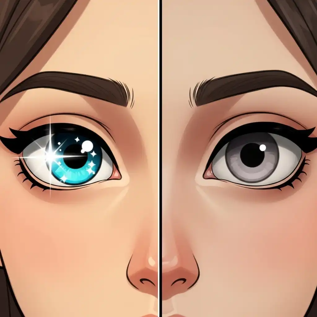
Portrait Catchlights

Preserve authentic catchlights in eyes during portrait retouching—they anchor vitality and human connection. These specular highlights, reflections of your actual light source, vanish easily beneath aggressive cloning or healing brushes, leaving subjects eerily flat. When brightening eyes, gently amplify existing catchlights rather than inventing new ones; fabricated highlights rarely match the genuine source's angle, shape, or luminance quality. Observe how light naturally wraps across the cornea. Subtlety proves essential: a slightly lifted curve adjustment targeting only the brightest specular points often suffices. Remember that eyes communicate through reflected light—removing these delicate markers severs the subject's engagement with the viewer, transforming living presence into polished vacancy.

Comparison between vibrance and saturation adjustments

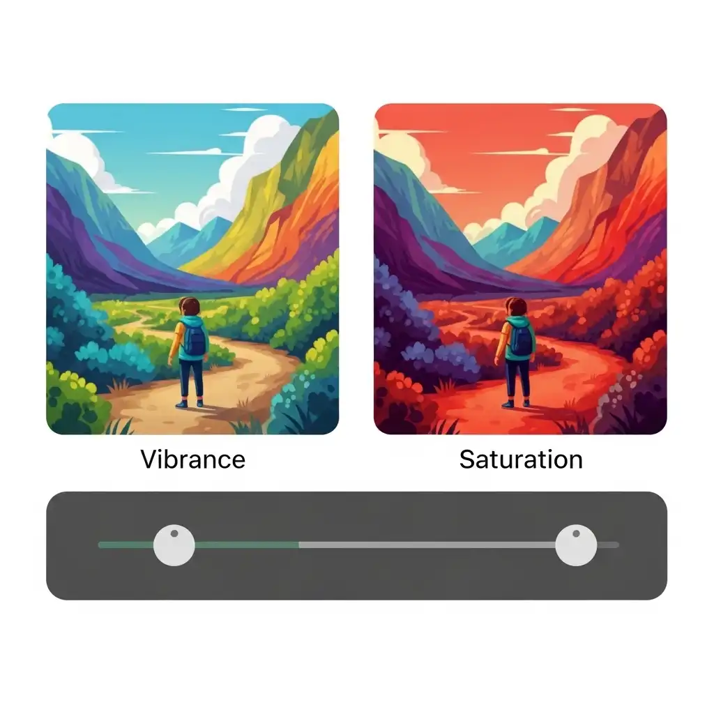
Vibrance vs Saturation

Recognize that saturation and vibrance serve fundamentally distinct purposes in color refinement. Vibrance intelligently targets desaturated hues while protecting already-intense colors and preserving natural skin tones—making it ideal for general enhancement. Saturation applies uniform intensity across every color channel, frequently pushing reds and yellows into unnatural territory, especially within complexions. Reserve saturation adjustments for deliberate, localized color shifts where uniform amplification serves your vision. For overall tonal enrichment, vibrance provides safer, more nuanced results. Understanding this distinction prevents the garish oversaturation common in amateur work. Let vibrance handle foundational color balance; deploy saturation sparingly as a surgical tool rather than a broad brushstroke across your entire image palette.

Saving custom presets in photo editing software

Custom Presets

Create custom presets reflecting your evolving editing signature once you've refined a consistent aesthetic approach. Whether it's particular tone curves, restrained color grading, or subtle grain application, saving these configurations accelerates workflow dramatically while ensuring visual continuity across portfolios or social feeds. Presets aren't creative shortcuts—they're efficiency tools that handle technical repetition, freeing mental space for image-specific decisions. Always treat presets as starting points requiring subtle customization per photograph; lighting conditions and subject matter demand nuanced adaptation. This practice builds recognizable style without sacrificing individual attention. Over time, your preset library becomes an extension of your visual language—streamlining execution while maintaining the thoughtful variation that distinguishes professional work from formulaic processing.

Skin retouching using frequency separation technique

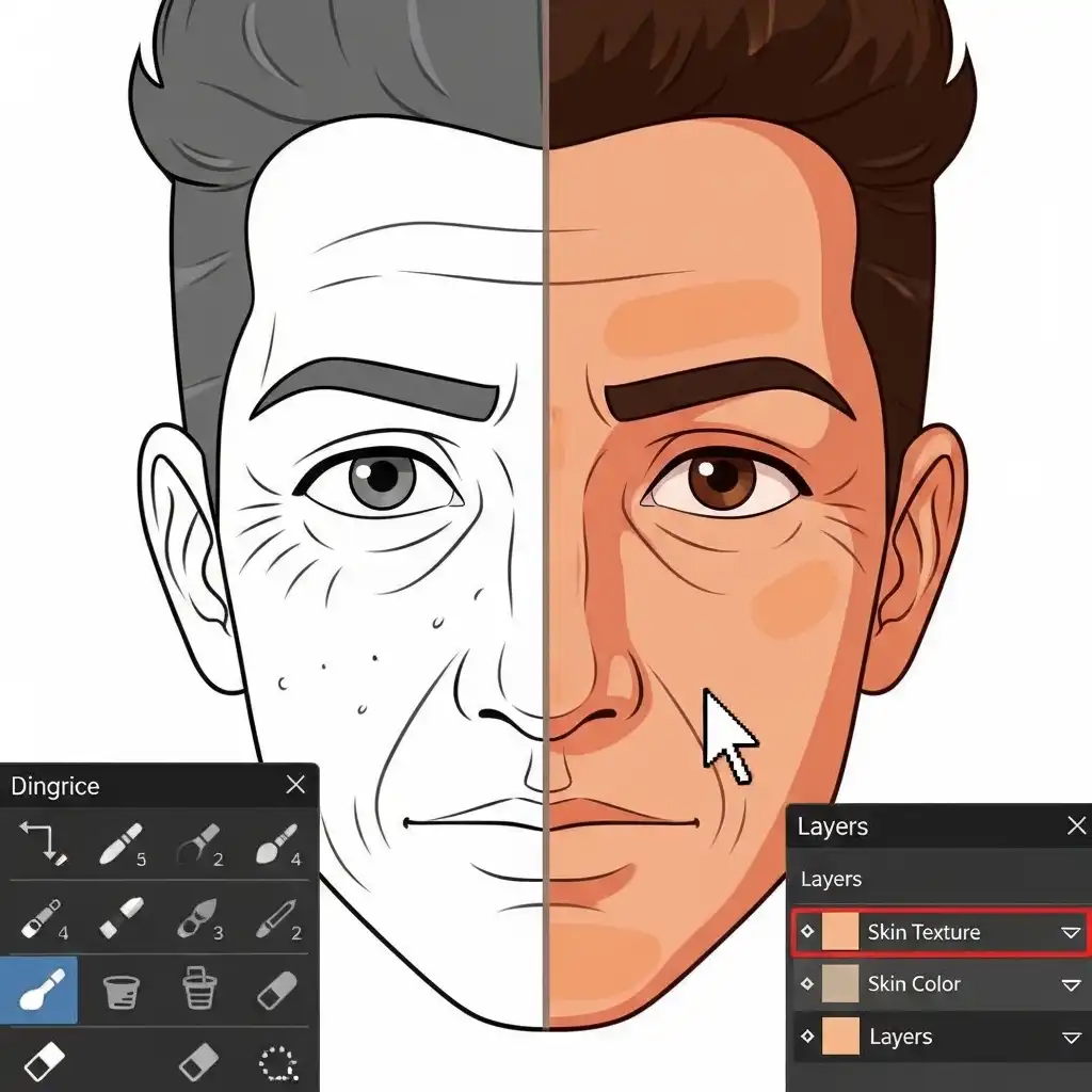
Frequency Separation

Master frequency separation for sophisticated skin retouching that honors natural texture. This method isolates color and tone information (low frequency) from surface detail (high frequency) across separate layers. Smooth discoloration and uneven tones on the low-frequency layer while preserving pores, fine lines, and skin texture on the high-frequency layer above. The result feels authentically polished rather than digitally erased. Avoid over-smoothing either layer—subtlety maintains believability. This technique demands practice but eliminates the waxy, plastic appearance caused by heavy-handed cloning or surface blur filters. Remember that perfect skin lacks character; your goal is evenness with integrity, not clinical uniformity. Texture tells stories—preserve its quiet narrative while correcting genuine imperfections.

Choosing the correct file format for image saving

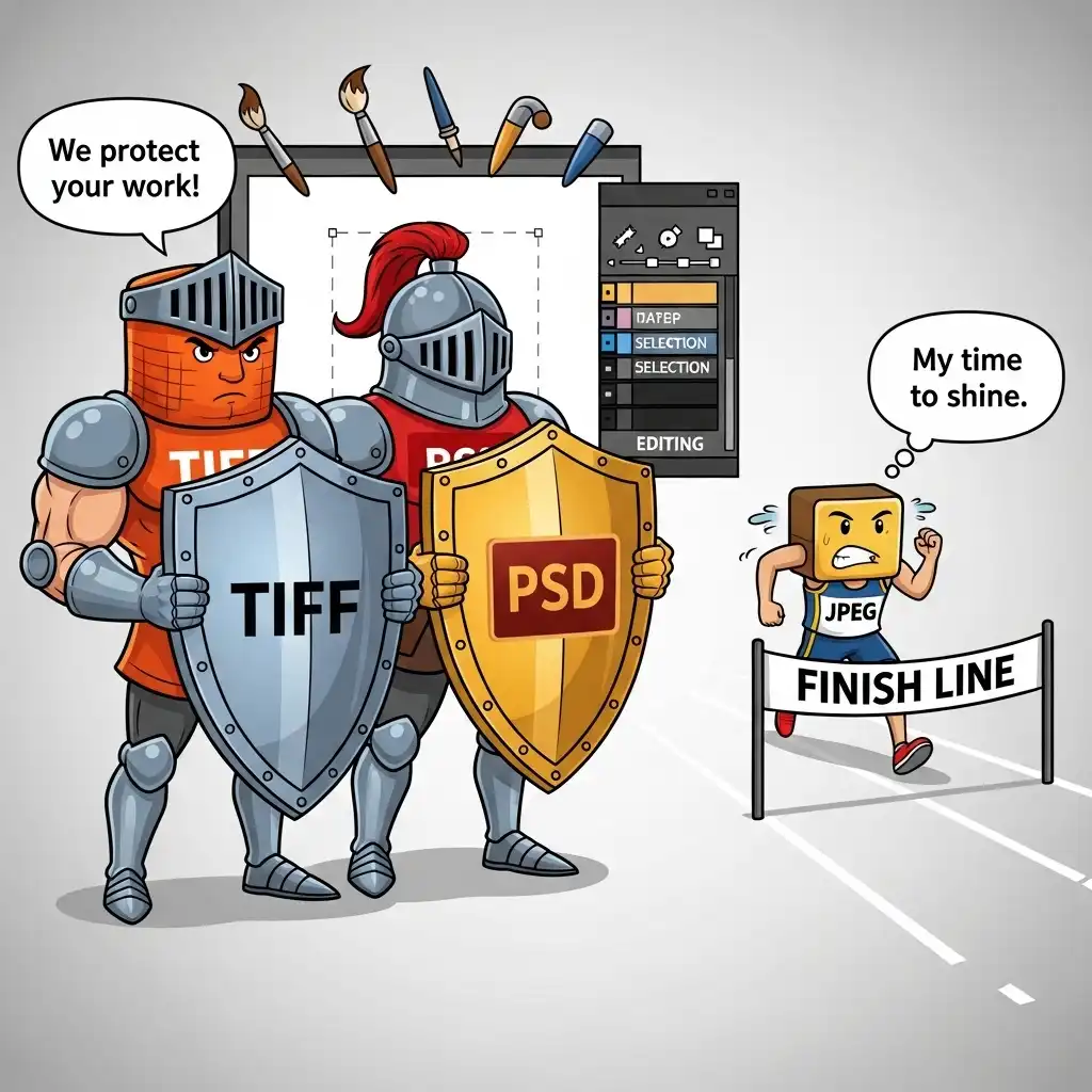
Mind File Formats

Mind your file formats conscientiously throughout the editing pipeline. Maintain lossless formats like TIFF or layered PSD during active editing to prevent generational degradation from repeated saving. Each JPEG resave introduces cumulative compression artifacts that permanently degrade image data. Reserve JPEG conversion strictly for final delivery, selecting quality settings between ninety and ninety-five percent for web use—this range typically balances manageable file size against visible artifact prevention. For print work, deliver TIFFs at appropriate resolution. Never edit directly on JPEG originals; immediately convert to a non-destructive format upon import. This discipline preserves maximum image integrity through multiple revision cycles, ensuring that your final output reflects intentional creative choices rather than technical compromises from careless format management.

Adding subtle film grain texture to digital photos

Subtle Film Grain

Apply subtle film grain to counteract the sterile smoothness resulting from aggressive noise reduction or intensive skin retouching. Over-processed areas often appear unnaturally flawless, drawing unwanted attention to manipulation rather than blending seamlessly with untouched regions. Introduce minimal grain—typically one to three percent intensity—with fine particle size to reintroduce organic texture. Apply selectively using layer masks to target only smoothed zones, avoiding already-textured areas. This technique bridges the perceptual gap between edited and original image data, restoring tactile authenticity. Granulation should feel inherent to the photograph, not overlaid. Used judiciously, it grounds digital perfection in physical reality, reminding viewers of photography's material roots while masking the telltale signs of excessive digital intervention.

Using the color wheel to find complementary colors

Study Color Wheel

Study the color wheel to harness complementary relationships with intention. Colors opposite one another—blue and orange, purple and yellow, red and green—generate natural visual energy when balanced thoughtfully. Rather than inventing these pairings artificially, identify and gently enhance existing complementary notes already present within your composition. Subtle reinforcement reads as harmonious; forced contrasts appear theatrical and distract from your subject. Adjust saturation and luminance to let these relationships breathe without shouting. Remember that restraint often proves more powerful than emphasis—allow complementary colors to converse quietly rather than compete for attention. This approach yields sophisticated color dynamics that feel discovered rather than designed, lending your images an effortless chromatic confidence.

Proper ambient lighting setup for photo editing

Ambient Lighting

Edit photographs in thoughtfully controlled ambient lighting to maintain accurate perceptual judgment. Bright room illumination causes pupil constriction, making your display appear deceptively dark and prompting over-brightened corrections. Complete darkness triggers pupil dilation, leading to underexposed results. Instead, cultivate soft, neutral ambient light matching your monitor's color temperature—ideally around 5500 Kelvin. Position lighting to eliminate screen glare without casting reflections. This balanced environment preserves your eyes' adaptation to mid-tones, the foundation of reliable exposure decisions. Professional colorists invest in controlled lighting environments for this reason; your editing space deserves similar consideration. Consistent ambient conditions form the invisible foundation of trustworthy color and tonal choices across every image you process.

Selecting specific tonal ranges with luminosity masks

Luminosity Masks

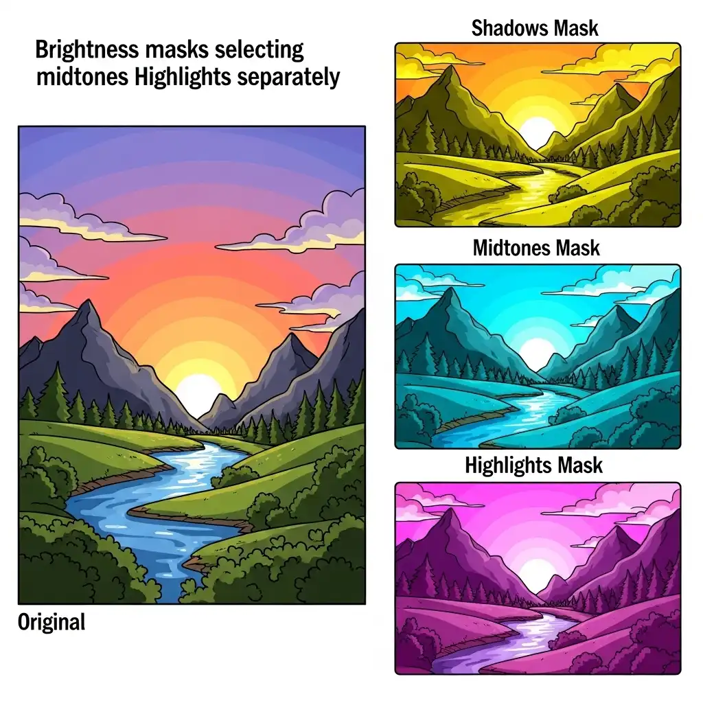
Employ luminosity masks for impeccably precise tonal adjustments that honor your image's natural luminance structure. These self-generating selections isolate specific brightness ranges—darks, midtones, highlights—with perfectly feathered edges that follow actual image data rather than arbitrary geometric boundaries. Unlike crude selection tools, luminosity masks create seamless transitions because they're derived directly from pixel values. Use them to dodge shadows without blowing out adjacent midtones, or recover highlight detail without muddying brighter areas. Mastering this technique transforms localized corrections from obvious interventions into invisible refinements. The learning curve proves worthwhile: luminosity masking represents the difference between competent adjustments and professional-grade tonal sculpting that respects your photograph's inherent light relationships.

Correcting perspective distortion and converging verticals

Converging Verticals

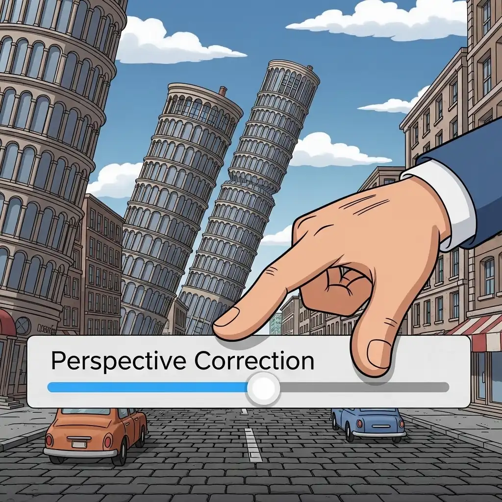
Correct converging verticals in architectural images using perspective tools with deliberate restraint. Leaning buildings undermine compositional credibility, suggesting technical error rather than intentional distortion. Apply lens correction profiles or manual perspective sliders to realign structures toward plumb verticality—but avoid overcorrection that introduces unnatural stretching or warping. The goal is structural believability, not geometric perfection. Sometimes slight convergence retains visual dynamism; complete rectification can feel sterile. Evaluate corrections at typical viewing size rather than extreme magnification. Remember that moderate perspective shift often reads as authentic camera positioning, while aggressive correction draws attention to itself. Aim for subtle intervention that supports your architectural subject's dignity without imposing rigid geometric dogma upon organic spatial relationships.

Structured photo editing workflow sequence

Editing Sequence

Establish a consistent editing sequence to build efficiency and comprehensive coverage. A reliable workflow might progress: crop and composition refinement, white balance correction, global exposure adjustment, contrast shaping, color grading, localized dodging and burning, sharpening, noise reduction, and final output preparation. Following this order for every image develops intuitive muscle memory while minimizing overlooked steps. Jumping randomly between adjustments creates redundant passes and inconsistent results. Your sequence should flow logically from foundational corrections to nuanced refinements. Adapt the framework to your style, but maintain its structure—consistency here isn't creative limitation but professional discipline. This methodical approach ensures no critical step gets forgotten during creative immersion, transforming editing from chaotic experimentation into purposeful craft.

Adjusting Hue, Saturation, and Luminance in HSL panel

HSL Mastery

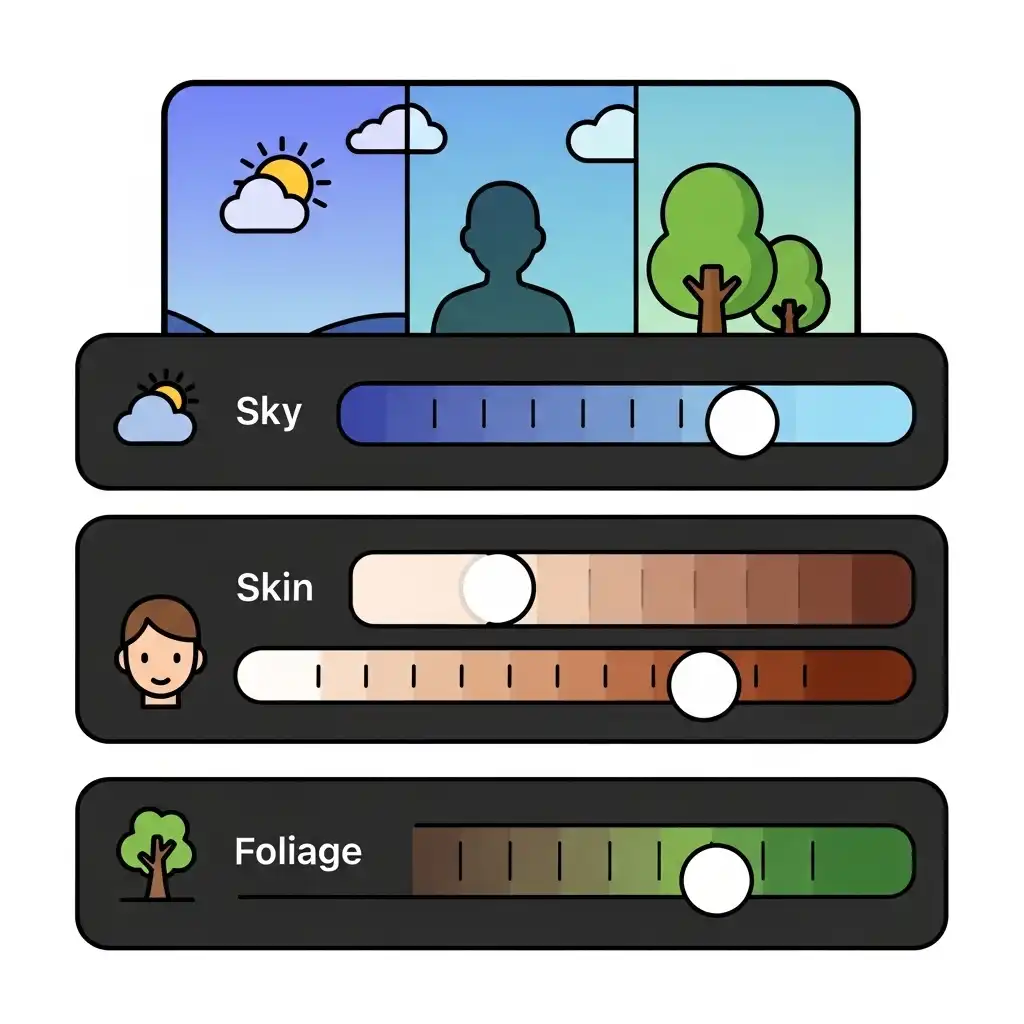
Leverage the HSL panel for surgical color refinement that broad saturation tools cannot achieve. Adjust individual hue ranges with precision: slightly desaturate oranges for natural skin tones, lift blue luminance to brighten skies without affecting other elements, or shift green hues toward golden yellows for autumn warmth. This targeted approach transforms competent edits into exceptional ones by respecting each color's unique role within your composition. Avoid uniform saturation boosts that treat all hues identically—nature rarely presents such simplicity. Instead, let the HSL panel become your color whisperer, making subtle shifts that accumulate into profound tonal harmony. Mastery here separates technical correction from artistic color storytelling, allowing you to guide the viewer's emotional response through chromatic nuance rather than blunt force.

Checking skin tone RGB values for accuracy

Skin Tone Values

Verify skin tones using your eyedropper tool on neutral facial areas as a technical reference point. In balanced Caucasian portraits under neutral lighting, expect approximate RGB values around 220, 170, 150—though these shift meaningfully across ethnicities and lighting conditions. Significant deviations often indicate white balance inaccuracies requiring correction. Use these numerical guides alongside visual assessment; numbers inform judgment but shouldn't override aesthetic intuition. Skin tone evaluation demands contextual sensitivity—golden hour warmth or cool window light legitimately alter color relationships. Let technical readings anchor your process while honoring the photograph's emotional lighting intent. This dual approach prevents both clinical color neutrality and unchecked color casts, striking the delicate balance between accuracy and atmosphere that defines professional portrait finishing.

Previous Page Next Page